

“Yay, it’s time for the annual performance reviews,” said no HR professional ever. I don’t know about your organization’s performance review process, but most HR people will tell you theirs could be improved in more than just a few ways. It can be a struggle to ensure feedback from every self-evaluation, manager review, and other contributors are collected timely. Making sure that feedback is detailed and the right ratings are given to employees is even more challenging.

The best reviews are thoroughly detailed with scores that can be easily defended through specific examples. Having specific examples is especially beneficial when a manager is giving ratings like “needs improvement” or “exceeds expectations”. If someone’s performance needs improvement, the individual will need to know what exactly to work on and a manager should use specific occurrences as examples. On the flip side, if one is exceeding expectations, specific examples will validate that person’s work and show how they are a top performer.
If your annual pay increases are tied to merit, it might be useful for HR to start looking at the results of performances reviews from a data perspective. HR should take the time to look at the overall picture to identify how many people received each score. Most of your talent should fall within the middle or what is typically called the “meets expectations” rating. As an HR professional, it’s important to stress that this is not necessarily a bad thing. A workforce that is meeting expectations indicates people are in the right roles and performing well. If you set high standards for performance, why is it a bad thing to meet expectations? Additionally, some of your talent will fall into the underperforming category and others will be in the “exceeding expectations” category.
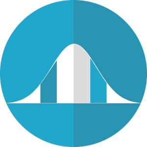
Plotting your scores on a line graph will help you see the distribution of ratings (an HR dashboard could do this for you). Ideally, you should end up with a bell curve, where many of your dots clustered in the middle. Then dots would trickle outwards as the number of people falling into your lower and higher scores decrease. If your dots are clustering more to either side instead of the middle, your distribution is skewed.
A skewed distribution means you have a large number of people receiving scores in either the higher or lower categories. Most commonly, a skewed distribution is created by managers over scoring performance. Someone that is performing well and is scored as “exceeding expectations” but, in reality, is just “meeting expectations”. If your review scores are tied to percentages for merit increases, it can be detrimental to your budget for everyone to receive the highest increase. This also makes it harder to identify who your true top performers are, which is the group you’ll want for succession planning and leadership development.
Keep in mind, we are mostly speaking to a pay-for-performance based compensation strategy where performance must be reviewed to give merit increases. Only use the bell curve if it makes sense for your organization’s strategy and process. As true with any metric, if you do choose to look at the distribution of scores, don’t forget to investigate the why behind your data’s story.
A good HR dashboard is the right tool for managing your workforce’s data, metrics, and analytics. It will take the pain of calculations out of your hands and let you focus on the analytics. Sign up today for a free demo of our automated HR dashboard.


Comments are closed.